ADEGA VELHA
Rebranding and Packaging Design
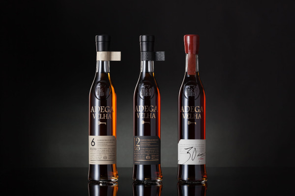
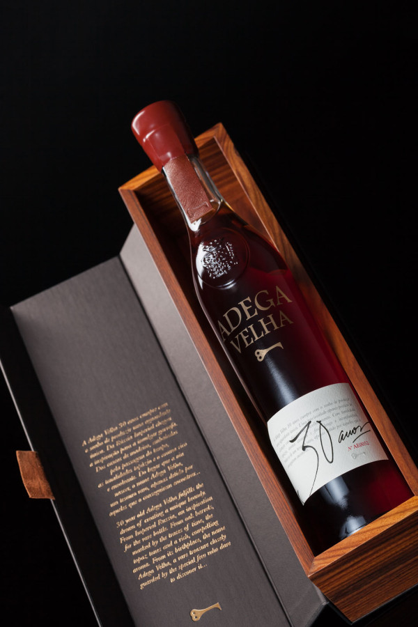
The project involved the rebranding of ADEGA VELHA and the development of packaging for its 6-, 12- and 30-year-old brandies. The challenge was to preserve the brand’s historic bottle while creating a clear distinction between the three expressions, highlighting the number of years spent ageing in oak barrels.
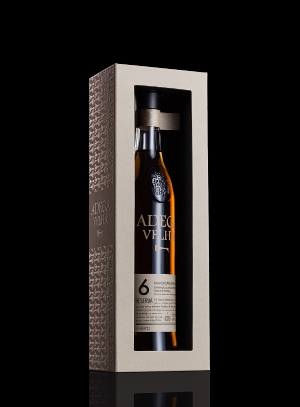
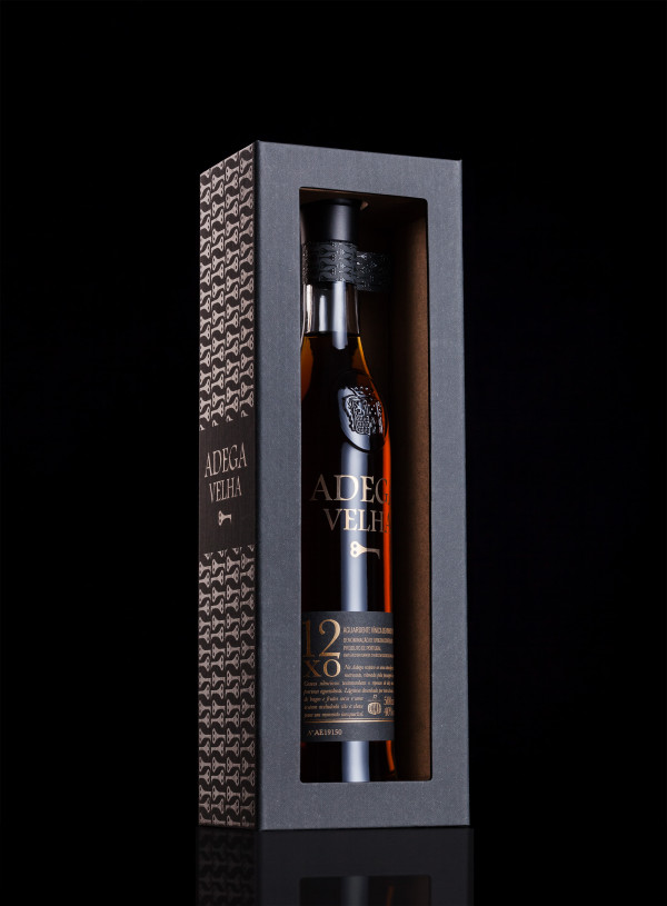
The brand symbol was inspired by the key to the main door of the warehouse where the brandy is aged and stored. The visual identity and packaging emphasise the natural colour of the spirit, the careful selection of papers and the combination of printing techniques, including hot foil stamping, screen printing and embossing.
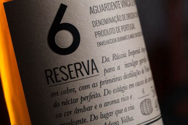
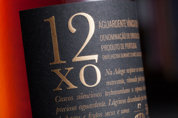
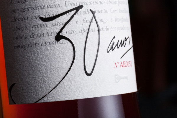
The labels for the 6- and 12-year-old brandies use Savile Row Tweed paper by Manter/Fedrigoni, distinguished by their base colours and typography. For the 30-year-old expression, White Cotton paper by Fasson/Avery Dennison was selected. Its texture enhances the handwritten lettering and the embossed detail. The die-cut shape of the labels reinforces the idea of a tag applied to the bottle, preserving its recognition as a historic element of the brand.
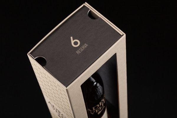
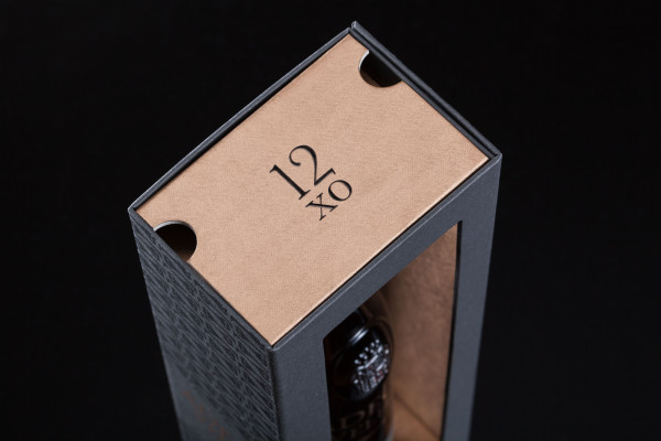
The packaging for the 6- and 12-year-old brandies was designed to protect and secure the bottle while allowing both labels to be read and the colour of the spirit to be seen, even when displayed in its packaging. For the 30-year-old expression, positioned at a higher price point, a more elaborate package was developed, featuring a darkened and varnished wood-clad base, complemented by a cardboard sleeve with matt gold hot foil stamping, matching the screen-printed gold detail on the bottle.
All three expressions are finished with a small leather tag embossed with the brand symbol: the key.