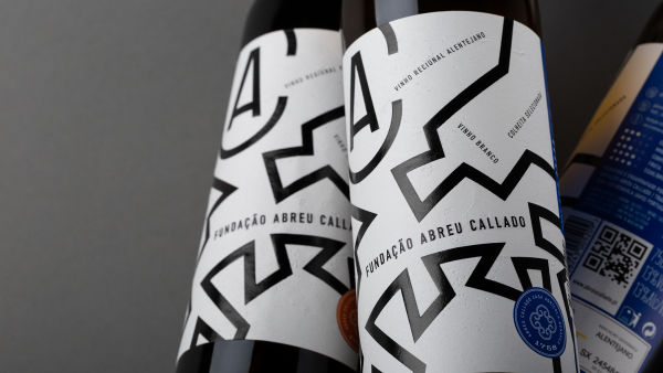
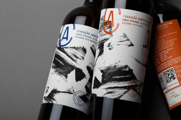
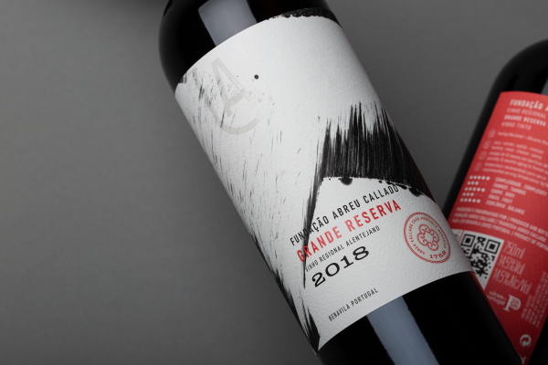
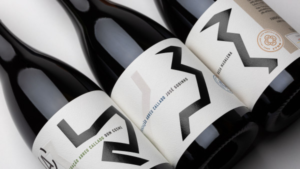
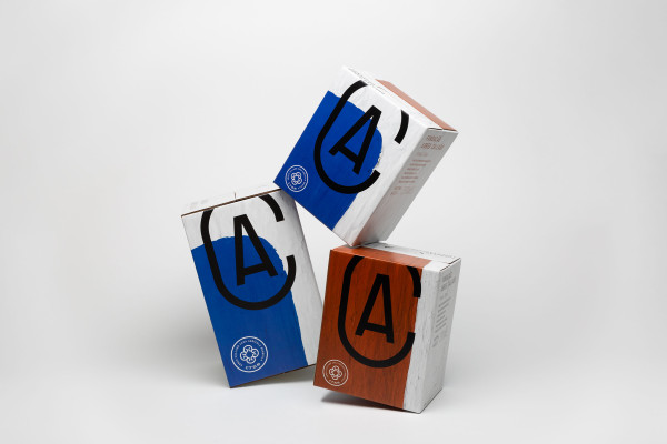
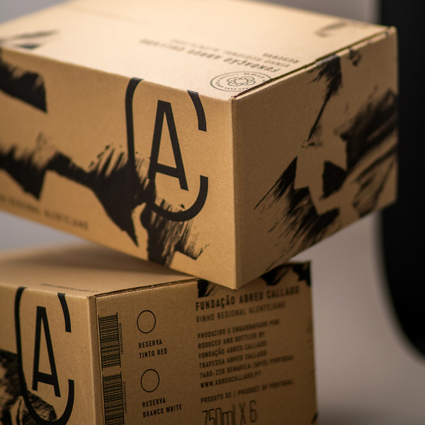
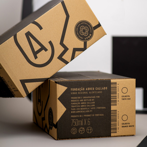
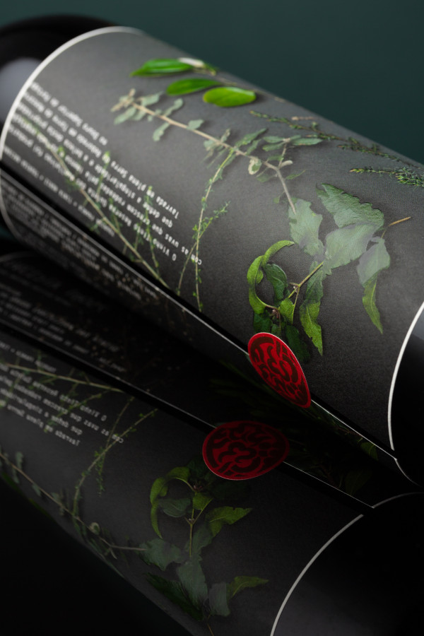
The abstract yet striking graphic design across the range of Fundação Abreu Callado wines has enabled the creation of a contemporary style characterised by a minimalist approach, whilst retaining the texture and character that this region (the Alentejo) conveys. The new visual identity is a (seemingly) simple yet luminous and striking design on the shelf, setting it apart from the competition in a positive way. An example of this is even the ‘bag-in-box’ packaging, which stands out thanks to the imagery inspired by the whitewashed walls of the houses belonging to the Foundation, where the texture and colour evoke a distinct sense of the Alentejo, enhancing this type of packaging.