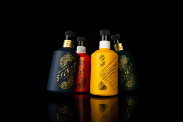
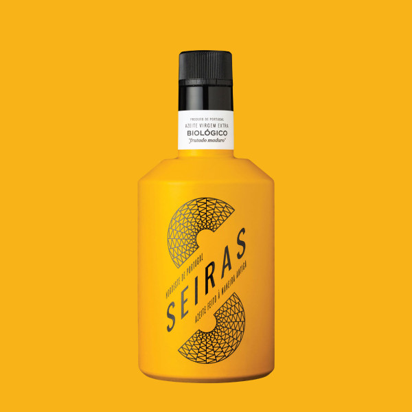
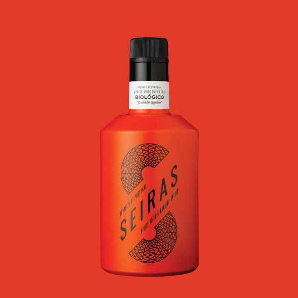
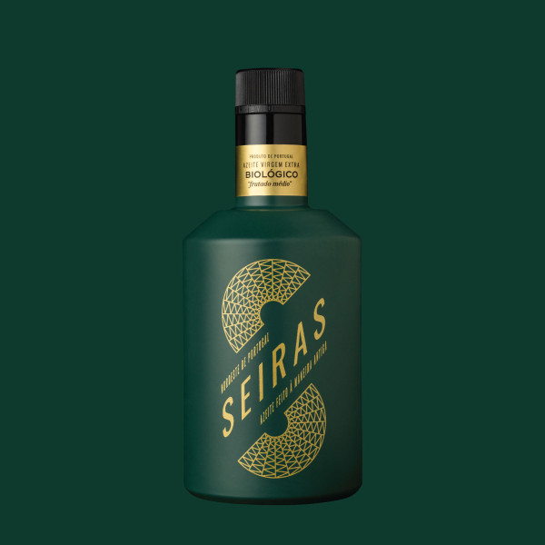
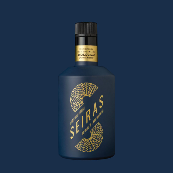
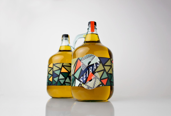
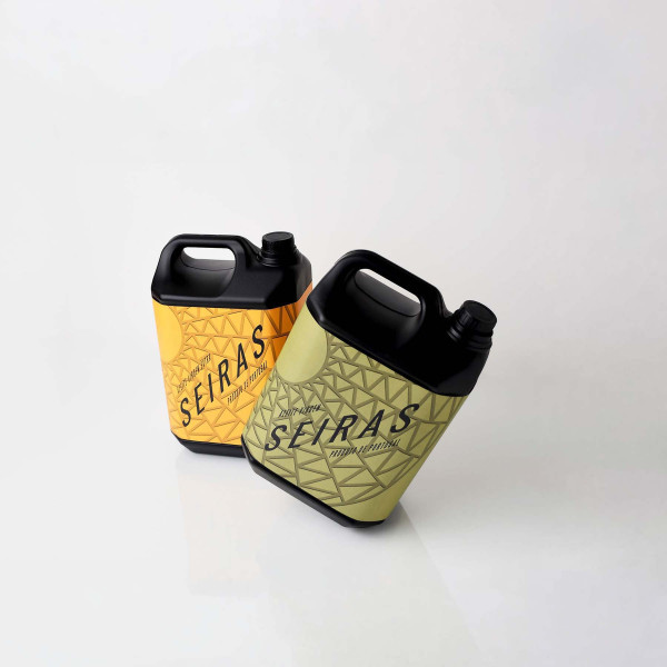
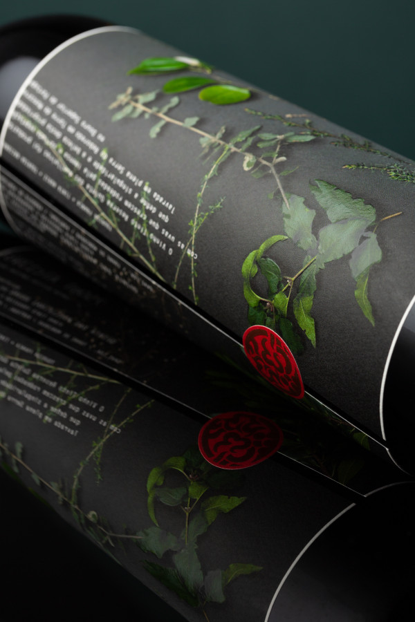
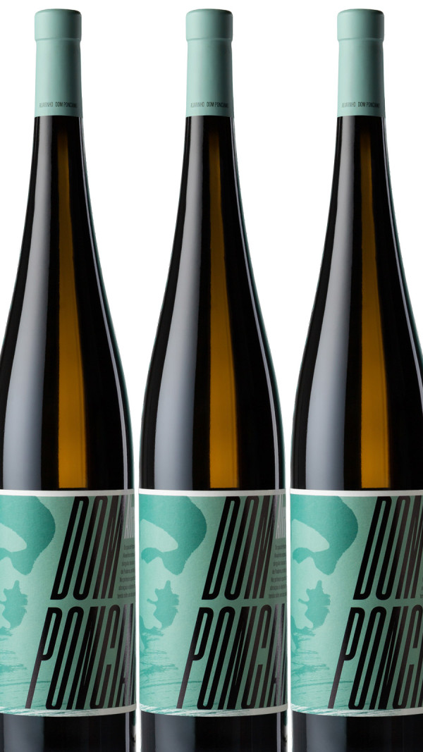
The brand SEIRAS, based on the lines of the basket from which it gets its name, offers resistance, incorporates a sense of movement, and transports us to the hustle and bustle of the olive oil lagar. The tilted positioning of the name underscores the motion of the letter S. The colours used for brand identity, in the silkscreen printing and in the painting on the bottles, were chosen to differentiate the intensity of each organic olive oil.
The result is a striking image that emphasises the position of the brand and this premium product, produced in small quantities, making the link between the traditional process and a contemporary image.
The result is a striking image that emphasises the position of the brand and this premium product, produced in small quantities, making the link between the traditional process and a contemporary image.